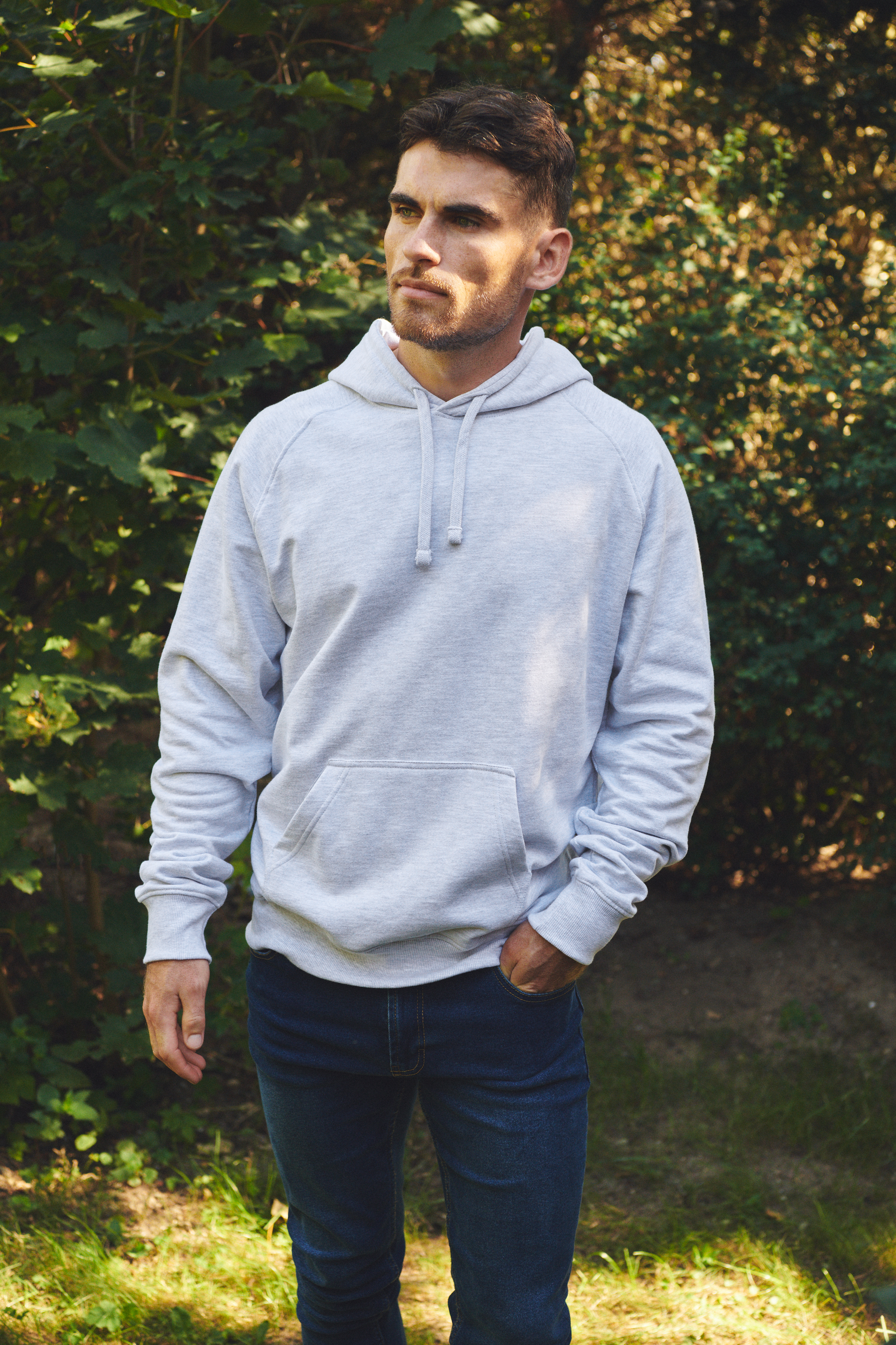
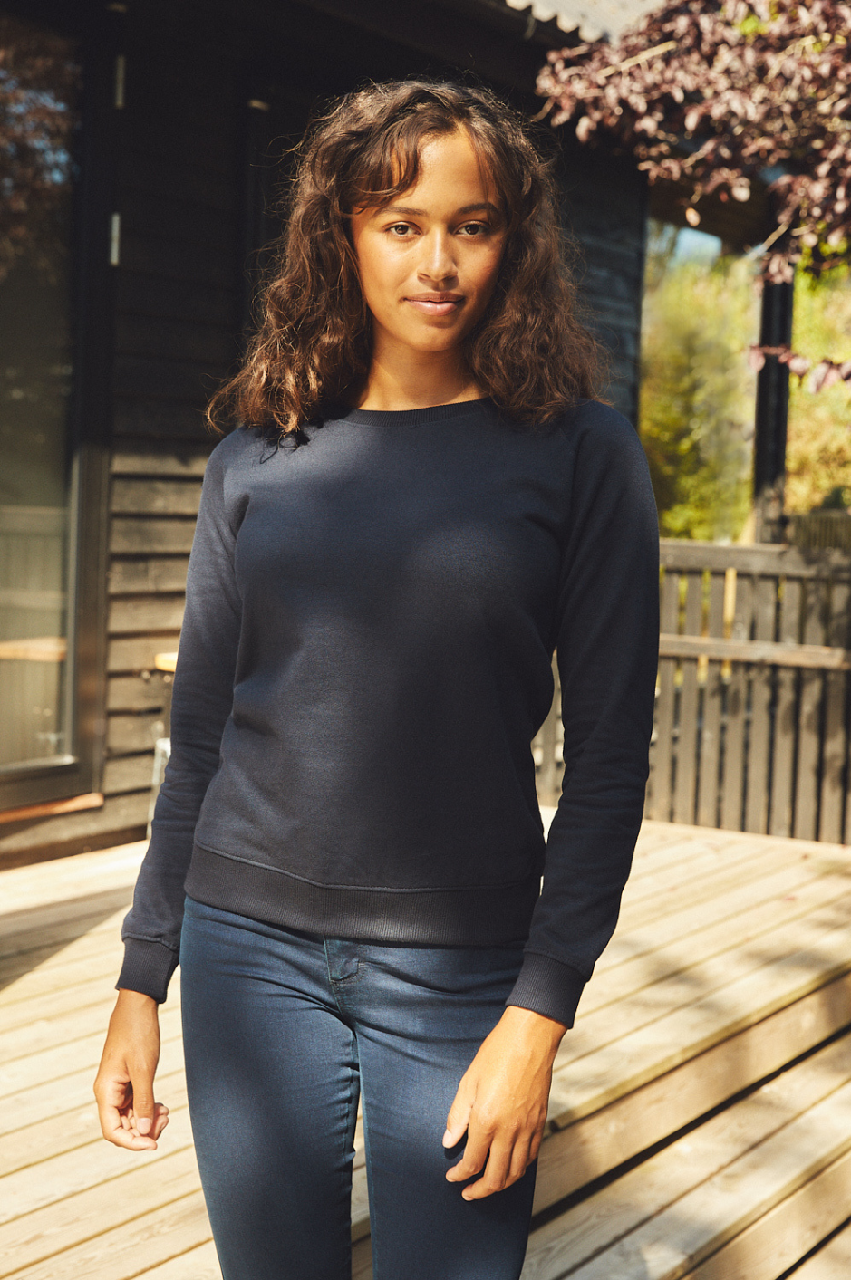
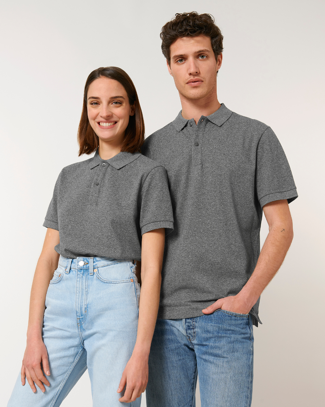
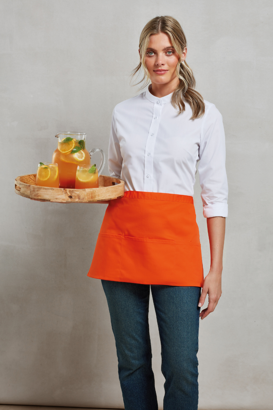
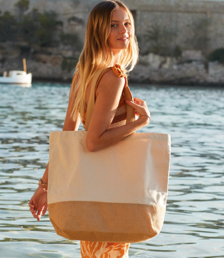
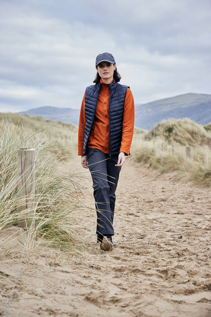
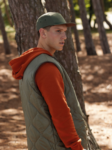
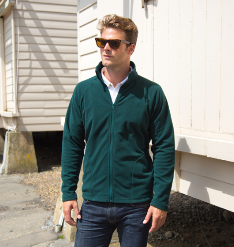
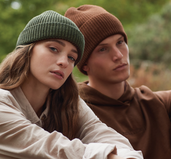
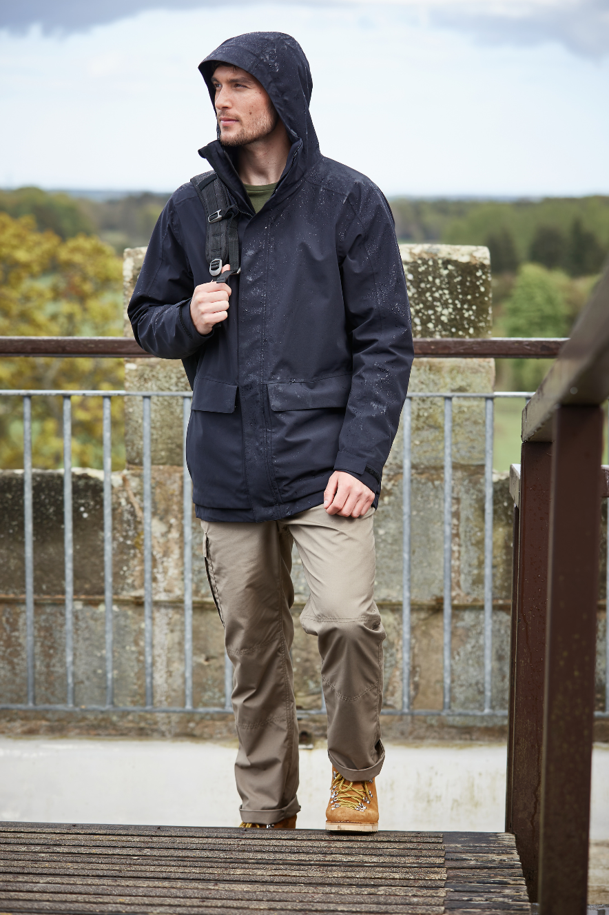
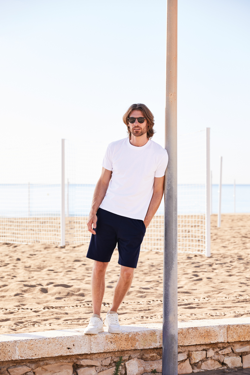
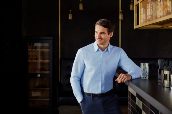
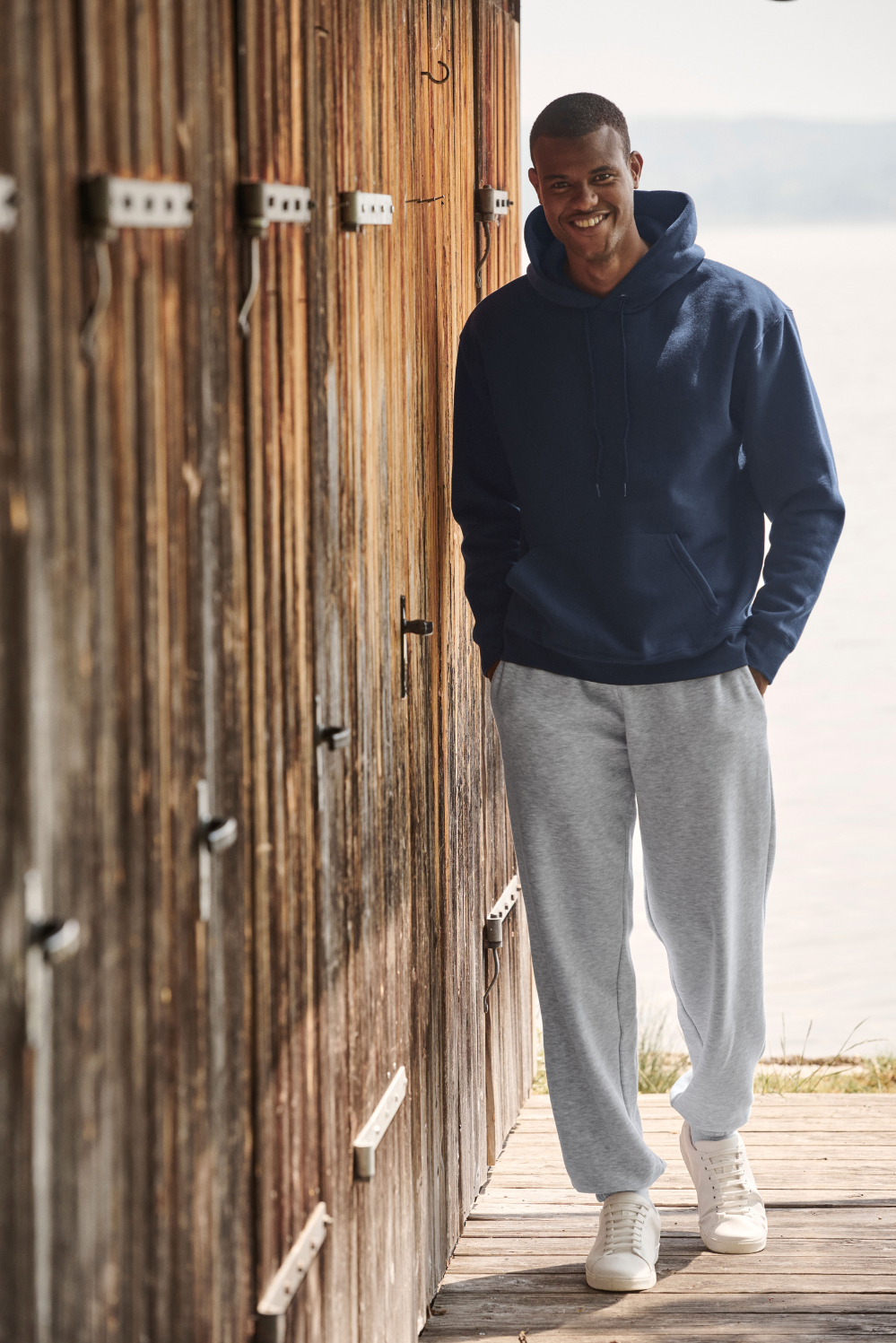
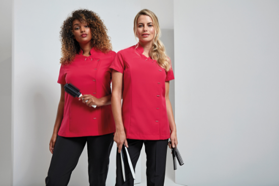
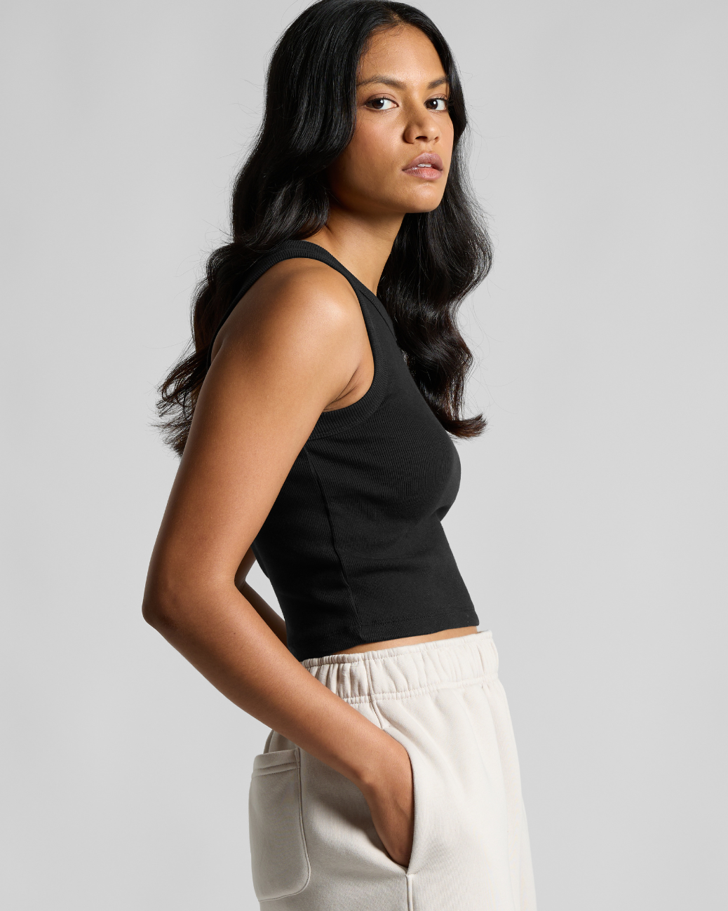
Skip to content

How to Make a Logo in Photoshop

Taking the time to create a business logo yourself gives you the freedom to experiment with different styles, finding a solution that best reflects you and your organisation, and having programmes such as Photoshop available make it even simpler to do yourself. However, sometimes it can be tricky to know where to begin, which is why we've created this handy guide to point you in the right direction.

Getting Started

The first thing you need to do when making a logo in Photoshop is to set up your documents so that the finished product is suitable for sending to print. To do this, make sure you:

  1. Set the colour mode to CMYK (this is what printers use)
  2. Set the resolution to 300dpi to ensure the quality is high enough for printing – this step is the most important
  3. Set your width and height to the right size for your print

Choosing Your Typeface

If you're incorporating text into your logo, you can use free resources such as Font Squirrel to find fonts. Font Squirrel includes fonts that are free for commercial use, but there are loads of other type foundries to explore too, just be sure to check the licence before using.

When choosing your font, it's important to pick one that best reflects your business. You can read more about this in our guide to What makes a good logo.

It's also important to make sure the font size you go for is legible for the size of your logo. The best way to check this is to print off the logo yourself, and check you can read it properly.

Once you've made your choice, select the Type tool to put your test onto your canvas. You can then make use of the Character panel in Photoshop to customise your font. For example, you can change the size, weight and other settings such as kerning and tracking. This tool is found under Window > Character in the toolbar.

Using Your Photoshop Layers

Each element of your logo design sits in a different section called a Layer. You can use the Layers panel to see all the different elements on your canvas.

When adding multiple elements to your logo, such as shapes, text and images, you can use the layers panel to put each element in order, for example if you want your text to appear 'on top' and your images in the background, your text should be the top layer, and your image the bottom layer.

Adding Some Colour

There are plenty of free resources online to help you choose the perfect colour scheme for your logo, so you needn't spend hours finding the perfect combination of shades alone – unless you want to!

Coolors.co allows you to generate colour schemes by simply pressing the spacebar, while with resources such as Adobe Kuler, you can upload images and generate a colour scheme based on this. This option is perfect if you already have some aspects of your branding complete, and want to make sure your logo matches up.

Once you've chosen your colour scheme, you can change the colour of your text, shapes and images by using the Colour and Swatches panels.

Adding Images

If you want to add shapes to your logo, you can do so using the Rectangle Tool, Ellipsis Tool and the Custom Shapes Tool. If you’d rather go free-hand however, you can use the Pen Tool to start from scratch. If you have something in mind already, you can also import vector illustrations too.

Finishing Up

Once you’re happy with your logo, the final thing to do is save it in the right format. At Banana Moon, we accept .jpeg, .png and .gif files – head to File > Save As, and a dialog box will appear that gives you the option to choose your file format. Be sure to change the quality to ‘high’ too!

Drawer Title
Similar Products